Interactive Places
Dropdown Place
Add dropdown selection fields with predefined options for recipients to choose from
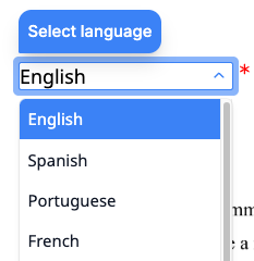
A dropdown place marks a location in a document where a recipient selects one option from a predefined list during the signing ceremony.
You can position dropdown places using either placeholders or fixed positions.
Options
The options property defines the choices available in the dropdown. You can provide either custom options or a predefined option set.
Custom options
Supply an array of objects. Each object requires a label (displayed to the recipient) and accepts an optional value (stored when the option is selected). If value is omitted, label is used as the stored value.
{
  //...
  "options": [
    { "label": "Full-time", "value": "full_time" },
    { "label": "Part-time", "value": "part_time" },
    { "label": "Contract", "value": "contract" }
  ]
  //...
}
Predefined option sets
For common selections like countries or US states, use a predefined option set by specifying one of these string values:
| Value | Description | Example values |
|---|---|---|
world_countries_names | Full country names | ”United States”, “Canada”, “Germany” |
world_countries_2_letter_codes | ISO 3166-1 alpha-2 codes | ”US”, “CA”, “DE” |
world_countries_3_letter_codes | ISO 3166-1 alpha-3 codes | ”USA”, “CAN”, “DEU” |
world_countries_numeric_codes | ISO 3166-1 numeric codes | ”840”, “124”, “276” |
us_states_names | Full US state names | ”California”, “Texas”, “New York” |
us_states_2_letter_codes | US state abbreviations | ”CA”, “TX”, “NY” |
{
  //...
  "options": "world_countries_names"
  //...
}
Default Selection
Use the default property to pre-select an option when the dropdown is displayed. The value is matched first against the label of each option, then against the value. If no match is found, a validation error is returned.
{
  //...
  "options": "us_states_names",
  "default": "California"
  //...
}
Behavior
The behavior property controls how the dropdown is rendered during the signing ceremony.
| Behavior | Description |
|---|---|
auto (default) | Renders as a standard dropdown for 10 or fewer options, and as a searchable combobox for more than 10 options. |
select | Always renders as a standard dropdown list. |
combobox | Always renders as a searchable dropdown with type-ahead filtering. |
For large option sets like country lists, the auto behavior uses combobox since there are more than 10 options.
{
  //...
  "options": "world_countries_names",
  "behavior": "combobox"
  //...
}
Hints and Prompts
Use hint and prompt to guide recipients while making their selection.
hint: A tooltip shown when the recipient hovers over or focuses on the dropdown.prompt: Placeholder text shown inside the dropdown before a selection is made.
{
  //...
  "hint": "Select your country of residence",
  "prompt": "Choose a country..."
  //...
}
Capturing Input
Set capture_as to store the selected value in the envelope’s captures object. After the envelope is completed, retrieve the value using the key you specified.
Size and Appearance
width: The width of the dropdown field in points (1/72 inch). Must be between 30 and 540. Defaults to 30.font_size: The text size inside the dropdown, in points. Must be between 6 and 12. Defaults to 12.
Attributes
Specifies the type of place.
For a dropdown place, the value must be dropdown.
A unique identifier for this place within the document. Use this key to match the place to its position, either through a [[place_key]] placeholder in the document or an entry in fixed_positions.
Must start with a lowercase letter and contain only lowercase letters, numbers, and underscores. Maximum 32 characters.
The key of the recipient assigned to this place. Must match one of the key values in the envelope’s recipients array.
Specifies the list of options available in the dropdown.
You can provide either custom options or a predefined option set.
Custom options: An array of objects, each with a label (displayed to the user) and an optional value (captured when selected). If value is omitted, the label is used as the value.
"options": [
  { "label": "Option A", "value": "a" },
  { "label": "Option B", "value": "b" }
]
Predefined options: A string specifying a built-in option set:
| Value | Description |
|---|---|
world_countries_names | Country names (e.g., “United States”, “Canada”) |
world_countries_2_letter_codes | ISO 3166-1 alpha-2 codes (e.g., “US”, “CA”) |
world_countries_3_letter_codes | ISO 3166-1 alpha-3 codes (e.g., “USA”, “CAN”) |
world_countries_numeric_codes | ISO 3166-1 numeric codes (e.g., “840”, “124”) |
us_states_names | US state names (e.g., “California”, “Texas”) |
us_states_2_letter_codes | US state codes (e.g., “CA”, “TX”) |
Specifies the option that is pre-selected when the dropdown is displayed.
The value is first matched against the label of each option. If no match is found, it is matched against the value of each option. If no match is found, a validation error is returned.
Specifies the behavior of the dropdown during the signing ceremony.
Possible values:
auto(default): Automatically selects the best behavior based on the number of options. Usesselectfor 10 or fewer options, andcomboboxfor more than 10 options.select: Displays a standard dropdown list. Best for short lists where users can quickly scan all options.combobox: Displays a searchable dropdown with type-ahead filtering. Best for long lists where users need to search for their selection.
Specifies whether the recipient must select an option to complete the signing ceremony.
Possible values are required or optional. The default is required.
A placeholder message shown inside the dropdown field during the signing ceremony.
Maximum length is 100 characters.
Learn more in Hints and Prompts.
A tooltip message displayed when the user hovers over or focuses on the dropdown field during the signing ceremony.
Maximum length is 100 characters.
Learn more in Hints and Prompts.
A key that stores the recipient’s input in the envelope’s captures object. When set, the value entered or selected by the recipient is saved under this key after the envelope is completed.
Must start with a lowercase letter and contain only lowercase letters, numbers, and underscores. Maximum 32 characters. Set to null to disable capture.
The font size in
Must be between 6 and 12. The default is 12.
The width of the dropdown field in
Must be between 30 and 540. The default is 30.