Interactive Places
Text Input Place
Collect information from recipients during signing with text input fields
A text input place marks a location in a document where a recipient types free-form text during the signing ceremony. These serve the same purpose as form fields in other e-signature platforms.
You can position text input places using either placeholders or fixed positions.
Hints and Prompts
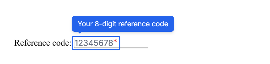
Use hint and prompt to guide recipients while they fill out a text field.
hint: A tooltip shown when the recipient hovers over or focuses on the field.prompt: Placeholder text displayed inside the field. It disappears when the recipient starts typing.
{
  //...
  "hint": "Your 8-digit reference code",
  "prompt": "12345678"
  //...
}
During the signing ceremony, the field appears like this:
Format Validation
The format property validates what the recipient can enter. You can use a predefined format or a custom regular expression.
Predefined formats
| Value | Description |
|---|---|
email | Email address |
zipcode-us | US ZIP code |
Custom regular expressions
Wrap a regular expression in forward slashes to define a custom format. For example, to require exactly 8 numeric digits:
{
  //...
  "format": "/^[0-9]{8}$/"
  //...
}
Format messages
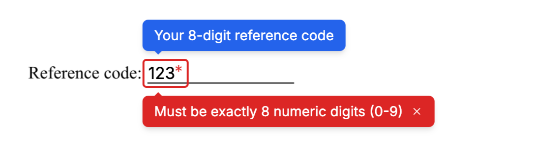
Set format_message to show a custom message when the recipient’s input does not match the required format.
{
  //...
  "format": "/^[0-9]{8}$/",
  "format_message": "Must be exactly 8 numeric digits (0-9)"
  //...
}
During signing, the message is displayed like this:
Capturing Input
Set capture_as to store the value the recipient enters in the envelope’s captures object. After the envelope is completed, you can retrieve the value using the key you specified.
Size and Appearance
width: The initial width of the field in points (1/72 inch). The field may expand beyond this width as the recipient types.font_size: The text size inside the field, in points. Must be between 6 and 12. Defaults to 12.
Attributes
Specifies the type of place.
For a text input place, the value must be text_input.
A unique identifier for this place within the document. Use this key to match the place to its position, either through a [[place_key]] placeholder in the document or an entry in fixed_positions.
Must start with a lowercase letter and contain only lowercase letters, numbers, and underscores. Maximum 32 characters.
The key of the recipient assigned to this place. Must match one of the key values in the envelope’s recipients array.
A key that stores the recipient’s input in the envelope’s captures object. When set, the value entered or selected by the recipient is saved under this key after the envelope is completed.
Must start with a lowercase letter and contain only lowercase letters, numbers, and underscores. Maximum 32 characters. Set to null to disable capture.
A tooltip message displayed over the input text field during the signing ceremony.
Learn more in Hints and Prompts.
A placeholder message shown inside the input text field during the signing ceremony.
Learn more in Hints and Prompts.
Specifies whether the recipient must fill this field to complete the signing ceremony.
Possible values are required or optional. The default is required.
Defines the validation format for the user’s input.
Accepted values:
emailzipcode-us- a custom regular expression, enclosed in
/, for example:/^[a-z0-9]{1,10}$/
Learn more in Format Validation.
The message displayed when the user’s input does not match the required format.
Learn more in Format Validation -> Adding a Custom Message.
The initial width of the text input field in
Must be between 30 and 540. Defaults to 30.
The font size in
Must be between 6 and 12. Defaults to 12.